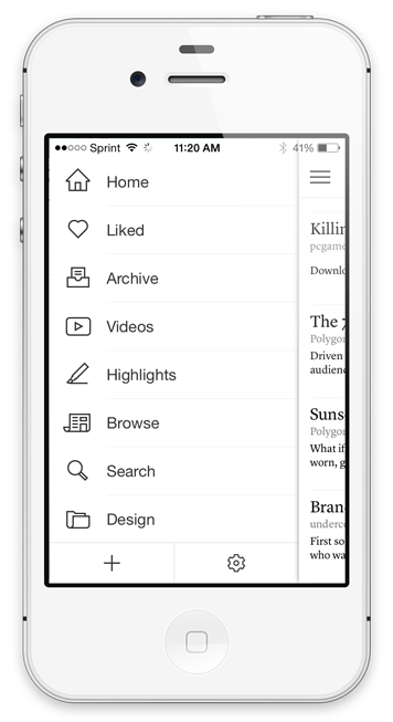
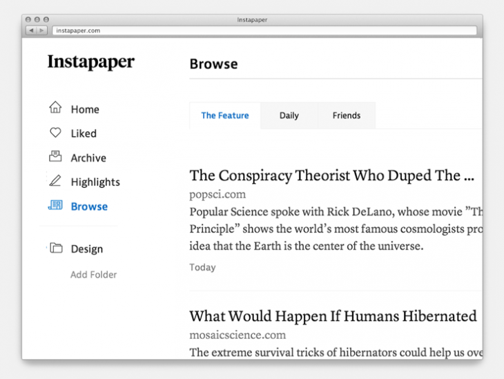
As part of Instapaper’s redesign, I worked with Justin VanSlembrouck to create a small set of icons for Instapaper’s core functions. The icons needed to be sparse enough to work at small sizes, but also made interesting enough to be used at larger scales if necessary. Additionally, the set was made linear to match the lightness of the app, where the UI takes a backseat to the content it displays.


